

What is a Normal Probability Plot?
A normal probability plot is a graphical representation of a data set used to assess whether the data follows a normal…
Read article →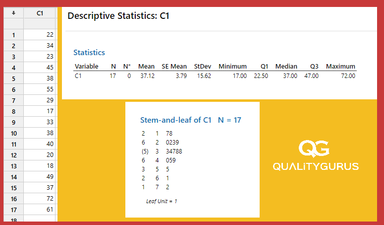
Solve the Puzzle of Stem and Leaf Plots
Have you ever encountered a stem and leaf plot and wondered what it is and how to interpret it? If so, you're not alone.…
Read article →
Visualize Your Data with Box and Whisker Plots!
Data visualization is a crucial aspect of any data analysis or presentation. It allows us to quickly and easily…
Read article →
Calculating Standard Deviation and Variance: Sample vs. Population
Standard deviation is a measure of how spread out a dataset is. It is calculated by finding the difference between…
Read article →
Calculating the Interquartile Range: A Quick Guide
The interquartile range (IQR) is a measure of the dispersion of a dataset. It is calculated as the difference between…
Read article →
Calculating the Range: A Quick Guide
The range is the difference between the largest and smallest values in a group of observations. To calculate the…
Read article →
Measurements of Dispersion (Variation)
In descriptive statistics, several common variation measurements are used to describe the spread or dispersion of a…
Read article →
Quantile (Quartile, Decile and Percentile): Manual Calculation + Microsoft Excel
Quantiles are an important statistical concept that allows us to divide data into equal groups. They are often used to…
Read article →