I've seen 500+ portfolios. Here's the problem.
Jan 11, 2026 1:46 pm
So I review a lot of portfolios.
As a coach, I look at 3-5 per week from clients preparing for job searches.
When I was hiring as a Head of Product Design, I reviewed 500+ over 2 years.
Here's the pattern:
90% of portfolios look exactly the same.
Same structure. Same language. Same case study format.
"I redesigned [feature] to improve [vague metric]."
Hero image. Problem statement. User research. Wireframes. Final design. Reflection.
Repeat 4-6 times.
Clean. Professional. Completely forgettable.
Here's what happens when you look like everyone else:
When I was reviewing portfolios as a hiring manager, I'd open 10-15 in a row.
After the 5th one, they all blurred together.
"Wait, was this the one with the e-commerce checkout? Or was that the other designer?"
The portfolios that stood out? They broke the pattern.
Not with flashy animations or elaborate case studies. With clarity and personality.
They answered immediately:
- Who are you? (Not just "UX Designer" but your actual perspective)
- What problems do you solve? (Specific, not generic)
- Why should I care? (What makes your approach different)
Most portfolios bury this. Or skip it entirely.
So hiring managers close the tab and move to the next one.
I see this with my coaching clients too.
They spend months perfecting case studies. Beautiful Figma layouts. Detailed process documentation.
Then I ask: "What makes YOU different from the other 50 designers applying?"
Silence.
"Um... I'm passionate about user-centered design?"
Everyone says that.
"I care about accessibility?"
So does everyone else.
The portfolio looks great. But it doesn't answer: Why hire you over someone else?
This is why Samaneh Dehghanpour is in the bundle.
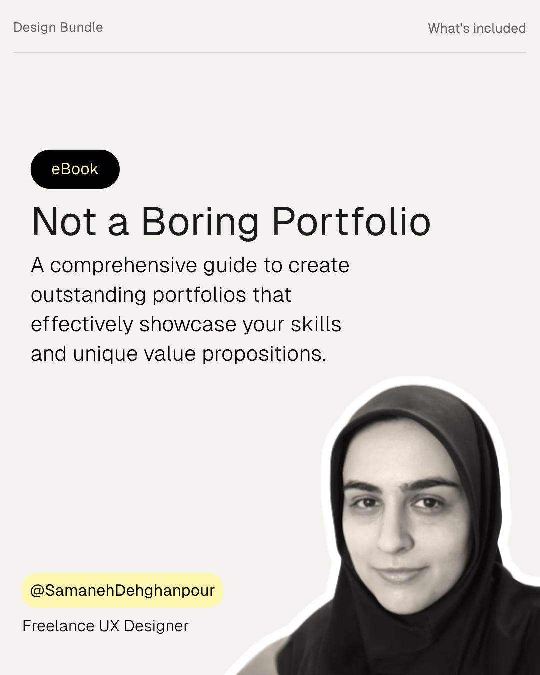
Samaneh is a Freelance UX Designer who's spent years analyzing what makes portfolios actually stand out.
Her eBook: Not a Boring Portfolio.
279 pages. 7 chapters. 100+ portfolio examples showing what works (and what doesn't).
It's not about making your portfolio "pretty." It's about making it memorable and strategic.
What you get:
- 279-page comprehensive guide
- 7 main chapters on portfolio strategy
- 100+ real portfolio examples (what works, what doesn't)
- Bonus: List of 100 best UX portfolios in the industry (for reference and inspiration)
- Bonus: Comprehensive UX metrics list with definitions (so you can quantify impact properly)
Standalone price: ~$35.
In the bundle: Part of the $299 package.
Who this is for:
Junior to mid-level designers with portfolios that look like everyone else's.
Designers getting zero callbacks despite having "good work."
Designers who don't know how to position themselves differently.
Why this matters for landing $150K-$300K roles:
Your portfolio is your first impression. Sometimes your only impression.
If it looks like everyone else's, you won't get the interview.
If it clearly shows:
- Your unique perspective
- Specific problems you solve
- Measurable impact you've driven
You get callbacks. Even if other designers have "better" visual design.
Samaneh's guide teaches positioning. Not just presentation.
Real talk:
Most designers spend 80% of their time on case study visuals and 20% on positioning.
The ones who land offers? They flip that ratio.
They spend time figuring out: What makes me the obvious choice for THIS role?
Then they build the portfolio around that answer.
That's what Samaneh's guide teaches.
The bundle includes this + 5 other resources.
- Femke: Product strategy and stakeholder influence
- Tommy: Making UX decisions with confidence
- Anfisa: UX research and business foundations
- Elizabeth: Notion workspace (21+ templates for organizing your work)
- Samaneh: Portfolio positioning (how to stand out, not blend in)
- Me: Job search system (land interviews without applying online)
$299 total. Jan 5-16 only.
Link: https://bundle.femke.design/?utm_source=joseph
Joseph
P.S. Title says it all: "Not a Boring Portfolio." If hiring managers are bored by your portfolio, they're not calling you. No matter how good your work is.