Estimated reading time: 3 minutes
Last month, I lost hours to unsubscribe to a service, and I got mad. It should have been a simple click.
The dark pattern problem
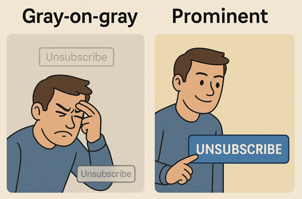
Many companies use what's called "dark patterns" to make unsubscribing as difficult as possible:
Tiny, gray-on-gray unsubscribe buttons
Endless confirmation popups
"Please contact our sales team" messages
They hope you'll give up and keep paying. These tactics might seem clever, but they're actually counterproductive.