Design Exhibitions, Content & Form, and ASCII Paint | Nguyen Gobber #4
Jun 28, 2023 1:59 pm
Hey!
It’s been a while since our last newsletter. The first half of 2023 was pretty exciting but also intense. So get prepared for an update from our design practice!
In this issue, you will learn about two exhibitions that we were a part of this year, how we think about content and form, our typefaces in use for the Chilean Architecture and Urbanism Biennial and a design exhibition in Berlin, and two wonderful projects that we stumbled upon.
As always, enjoy reading!
Hoang & David

NEWS
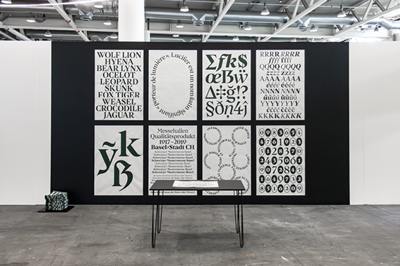
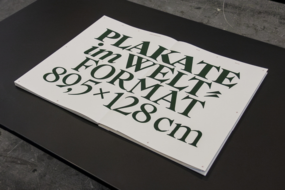
LUCIFER AT SWISS DESIGN AWARDS 2023
A rich and intense week in Basel
Our typeface Lucifer has been nominated for the Swiss Design Awards 2023. As finalists, we had the exciting opportunity to exhibit our type design work from 12 to 18 June in parallel to the Art Basel, Design Miami/Basel, and many more cultural events and exhibitions.
We were told that at least 12,000 visitors come to see the Swiss Design Awards exhibition every year. While that is an impressive number, there is a good chance that you were not one of them, so we wanted to share some images with you.
We’ve also prepared a digital version of the posters and the lookbook of our exhibition for you. Enjoy!

INSIGHTS
IS THERE CONTENT WITHOUT FORM?
About two sides of the same coin

Some would say that design is all about creating a proper form for a given content. So, if you observe the daily routines within a design studio, you should be able to see clients bringing in their raw content and designers creating various forms with it, may they be books, posters, websites, or something else.
In reality, though, clients never provide mere content. What would absolutely pure content beyond any form even be? No, they send their material in raw, unedited forms. Their manuscripts come as text files with default type settings, their unedited images are compressed into zip files, and so on.
Content always comes with a form, just not necessarily one that has the authorʼs desired effect on the recipients. As form critically affects the way content is interpreted, it canʼt just be disregarded. It’s the designer’s task to reshape the provided content so that the intended communication can happen.
There is no change in form without a change in content and vice versa. Content and form are two sides of the same coin, and designers always work on both, not just on the formal side as many believe.
We’re currently translating and reworking one of our older texts that deals with this topic in greater detail. More soon!
SELECTED PROJECT
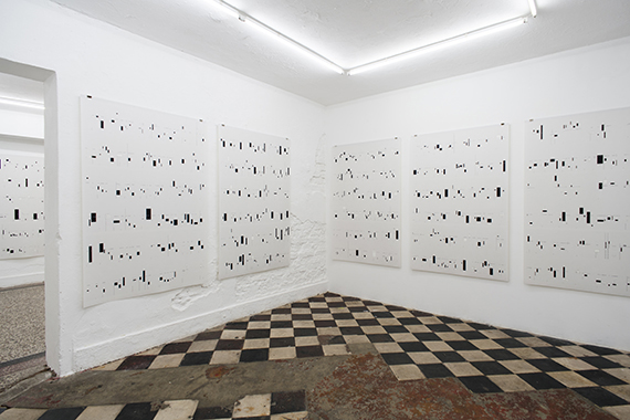
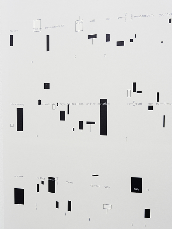
SAFE HARBOR
A graphical notation system for Russell Perkinsʼ artwork
Between 2022 and 2023, we developed the graphical side of Safe Harbor for and with Russell Perkins. The piece uses the so-called safe harbor disclaimers that are read out at the beginning of publicly-accessible corporate conference calls, in which recent earnings and future prospects are discussed. The art piece combines the safe harbor statements of all S&P100 companies into a single poetic text that is read out loud.
The visualisation we conceived for this poetic speech is printed on 24 large-sized sheets, appropriating the aesthetics of the financial world. Most notably, the speech was visualised through candlestick patterns, a visual notation system usually used to show stock performances. The artwork was exhibited earlier this year at Artists Unlimited in Bielefeld.
OUR FONTS IN THE WILD
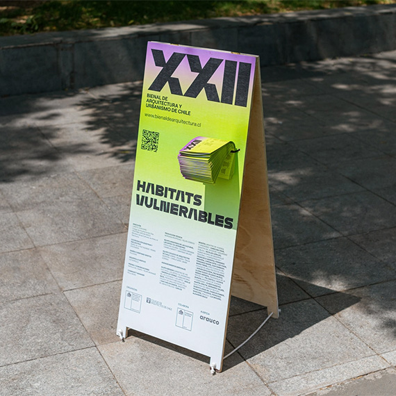
MONOPOL FOR THE 22nd CHILEAN ARCHITECTURE
AND URBANISM BIENNIAL
A bold identity for a vibrant biennial
Felicidad Pública designed the visual identity for the 22nd Biennial of Architecture and Urbanism of Chile, which has been the main event for disseminating architectural culture in the country since 1977. The event took place at the beginning of this year and was dedicated to the topic of vulnerable habitats.
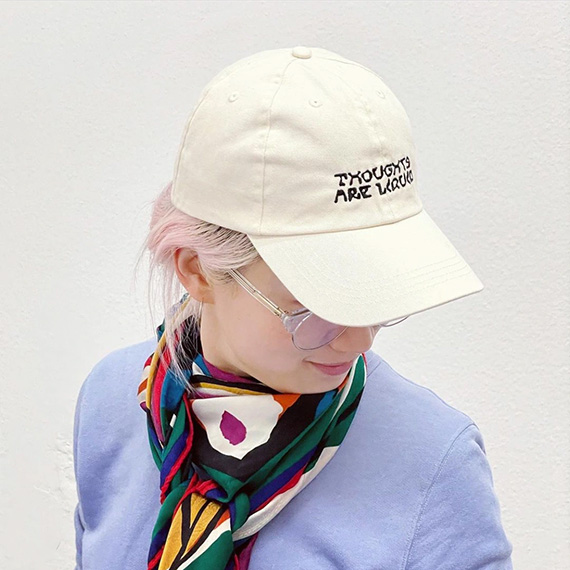
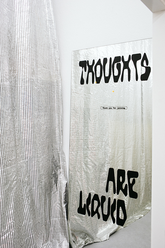
HOFMANN FOR THOUGHTS ARE LIQUID
A collaborative design experiment exhibited in Berlin
Thoughts are Liquid is an artistic exploration of collaborative design processes in which six graphic designers created 216 posters over the course of one year. The fruits of this experimental endeavour were exhibited in Berlin with a design that featured Hofmann … even as embroidery on a cap.
FROM OUR ORBIT
ARABIC DESIGN ARCHIVE
A wonderful digital collection of Arabic designs
The Arabic Design Archive (ADA) is a non-profit initiative that seeks to enable knowledge production about Arabic design and its history. Click on the button below to explore design beyond the Western canon.
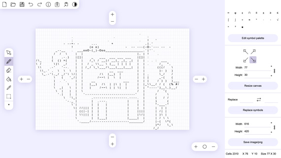
ASCII ART PAINT
Paint your next images in ASCII
ASCII Art Paint is a free and open-source web-based application where you can easily draw with text characters and hieroglyphs or convert your images into ASCII graphics. You can even save your creations as .png or .txt files when you’re finished.
NEED HELP?
Youʼre working on something valuable and important that unfortunately doesnʼt look so? We can help you by crafting a compelling appearance for your endeavour. → Get in touch!
Was this newsletter forwarded to you? → Sign up now!
Want to read previous issues? → Explore the archive!
Instagram → @t.m.hoangnguyen & @david.gobber
