Cover reveal! And thoughts on design
Apr 18, 2026 1:21 am
I wrote a version of this newsletter that my husband said was so full of ramblings on cover design that he couldn't find the pre-order link for my book. So let's get that news out of the way: Pre-orders for Tiger's Mouth are live wherever you get your books! I hope you will consider buying it from your local independent bookstore. Here is the one I work at, which will mail you a signed/personalized copy!
Now let my rambling begin.
When deciding on inventory for each season, buyers at bookstores look through thousands of titles in their catalogues. For me, a bad cover is often a dealbreaker. Booksellers can’t read and promote every new release we carry. The cover of a book is all the information most people ever get about a title, and that’s why we need each book to advertise themselves.
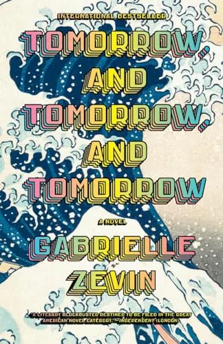
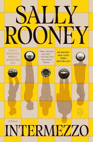
Needless to say, when we were in the process of creating the cover design for my novel, the stakes felt very high. We wanted something that would set correct expectations while also being memorable. We wanted it to look clearly like realistic fiction, a cross between literary and commercial (which we call “upmarket”), and we wanted it to look like a “big title”—one that has significant reach. Of the comparison titles we sent, my two favorites were Tomorrow and Tomorrow and Tomorrow and Intermezzo—both books with enormous heart and scope, by writers I love, whose careers I aspire to.
My novel proved a tough one to translate into an image. The title, Tiger’s Mouth, has a double meaning that reveals itself as you read the book, but at first glance I wanted it to communicate tension—that specific time in the life of young people living in a big city, when the pressures are mounting and everything feels like it’s closing in on you.
Because the title is figurative, it surprised me when the first cover option I saw featured two tigers on the front, with open mouths, tussling in a circle. I immediately understood they represented my main characters—two young men, both named Jack—who start the novel as strangers, become friends, and later, rivals. I liked the sense of competition and play evoked by the image. I also liked the yawning stretch of the title’s font, which seemed to signal that my characters were stretching themselves thin, each trying to reach impossible heights. Here are two drafts we considered.
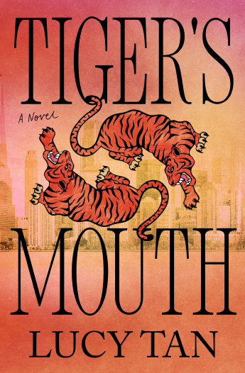
Many of us on the team really loved this concept, but several people worried it wasn’t quite right. Was the title redundant with the image? Would it seem like it took place in Asia rather than New York City, especially given my debut novel, What We Were Promised, which was set in Shanghai, and whose hardcover version also had a skyline on its cover?
So we went back to the drawing board and explored other options. Of the new batch, our favorite was a digital painting we commissioned, featuring two men in intimate conversation as they walked down a New York City street. This cover felt so different, and yet still true to Tiger’s Mouth. The soft, dreaminess of the colors and brushstrokes focused on the emotionality of the story.
Now we had two contenders—the original cover with the tigers and the newer one, with the painted men. Both were eye-catching, but we wanted the one that would do the better job of telling the story. In the end, our fear that the painted image might lead readers to assume romance between the two Jacks knocked it out of contention—and we returned to the version with the tigers. We updated the font, increased the size of the skyline, and made it more identifiably New York. Here it is! By the brilliant cover designer, Cassie Vu.
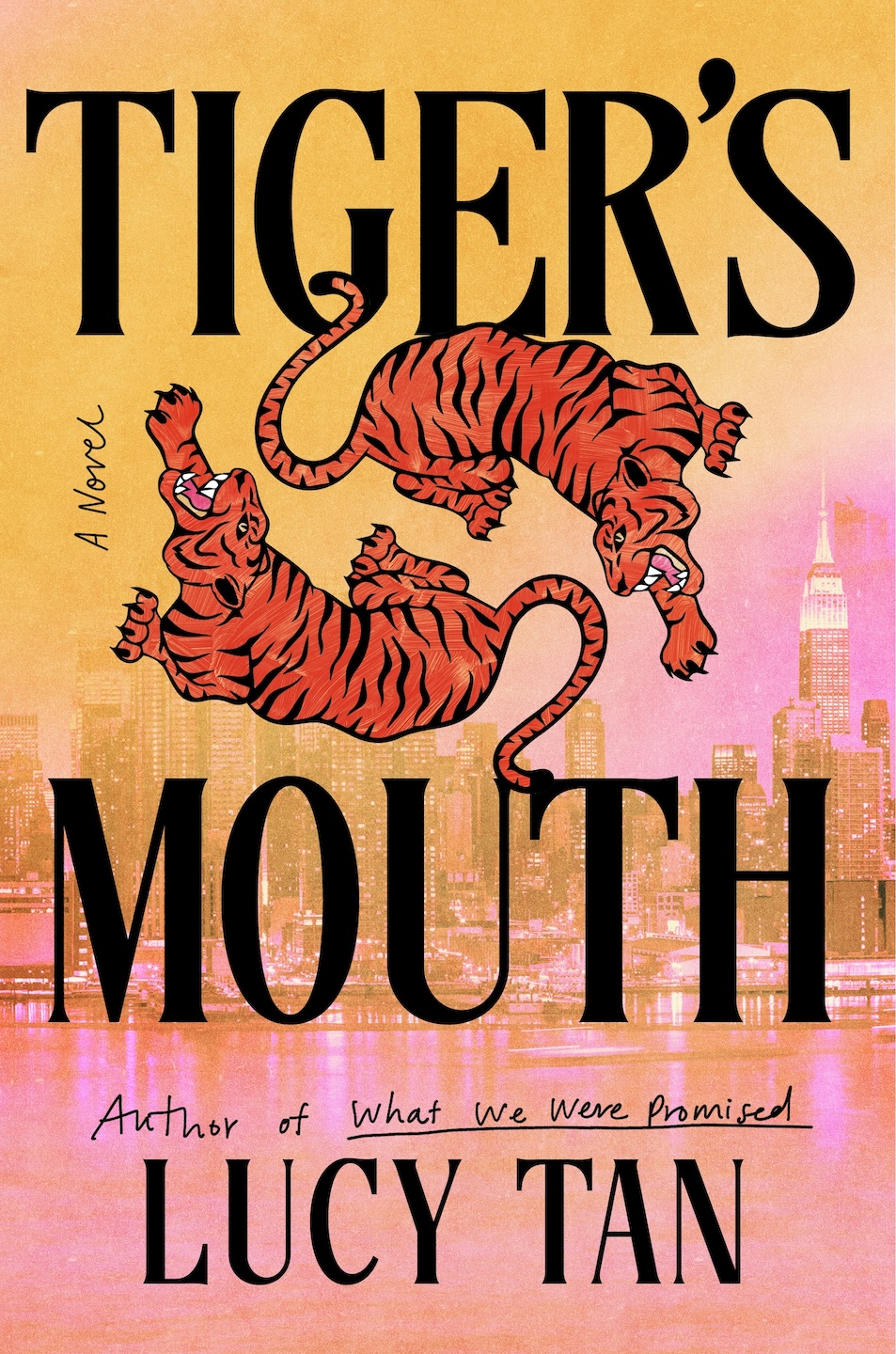
I love the bold font treatment (I had sent George Saunders' Vigil as inspiration). I love the pink and yellow, and the way it clashes a bit with the orange. I'm of the belief that in every striking cover, there's something a little "off" about the design. And in this one, I think it's the shade of pink against the orange, which feels cheeky and unexpected. I hope you find the overall effect as inviting as I do.
I wish I could show you the other version we considered, but we don’t have the license for that right now. Current plans are to include an updated version of the painted image on the inside of the book, on its endpapers. So if you buy the book, the runner-up version of the cover should be nestled inside!
A deeper dive into cover design
Speaking as a bookseller, I need a cover, at minimum, to do two things:
- Catch the eye
- Communicate its contents correctly (or correctly enough to be saleable)
It sounds easy, doesn’t it? But these targets are constantly moving and tricky to hit. This is because there’s a whole visual language to cover design built on a history of covers that have come before it. Each cover you see is nodding subtly at others in its vein. Have you ever glanced around in a bookstore and thought: Why do so many of these look similar?
The truth is, a certain degree of sameness is useful. If you walked into a store and had to read the jacket description of every book before understanding which genre it’s in, you’d probably get overwhelmed and leave, having only looked at a few titles. We have mixed-genre displays up all over Secret Garden Books, and need customers to be able to visually scan for what they want. We need romances to look like other romances, fantasies to look like other fantasies, nonfiction titles to signal non-fiction. If you’re a person who looks at books a lot, your brain is probably categorizing a cover the second you encounter it.
There are benefits to sameness, but there are also benefits to being unique and memorable, and this is why cover designers have such a tough job. They need to imagine, a year out, what a specific book will look like sitting next to others on a bookshelf. And not just that! But what it will look like digitally, on most-anticipated lists, where the title might have a fraction of a second to catch the eye of a reader scrolling past.
Case Study: Soft Core by Brittany Newell
If you've made it this far down into the newsletter, you're probably a book nerd and won't mind if I go even further. I want to talk about Soft Core, which published in hardcover in 2025. This funny but dark literary fiction novel is heavy on vibes and light on plot. It’s more irreverent than it is sexy, more literary than it is smut. The originality of Newell’s voice is what cemented it in my mind as one of my best reads of last year. Reading two pages is all it takes to know if you'll want to continue.
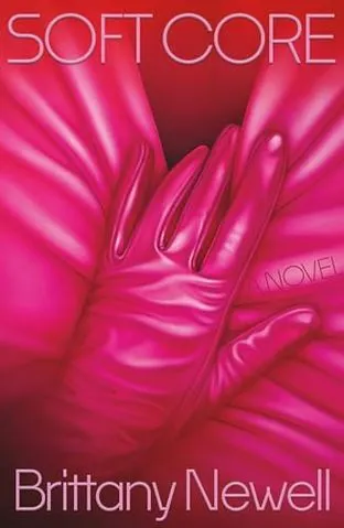
When I saw this cover for the first time in 2024, I was brand new to buying (I am still very new, but I mean I was brand-spanking-new) and my sales rep hinted that she thought the cover was risky. I thought, surely not in our progressive Seattle neighborhood! I was wrong. We only sold 9 in a year, despite primary placement on my “favorites” shelf with a shelftalker (handwritten words of promo).
And then the paperback came out about ten weeks ago, with a bright neon cover. The explicit kink was gone; this one let the title do most of the work. In that time, we’ve already sold eleven copies. It would have been even more, but we didn’t always have it in stock because I expected the pace of sales to be reflective of the hardcover. (This is where pre-orders would have helped!)
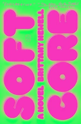
It’s hard to say for certain what changed this book’s sales potential. It could be that people found it easier to shell out paperback prices for a lesser-known author. It could be that its market demographic trends toward younger readers on a tighter budget. It could be that this book needed time for word to spread of its merits. Who knows? But let’s be honest… I think it was the cover.
Indie spotlight <3
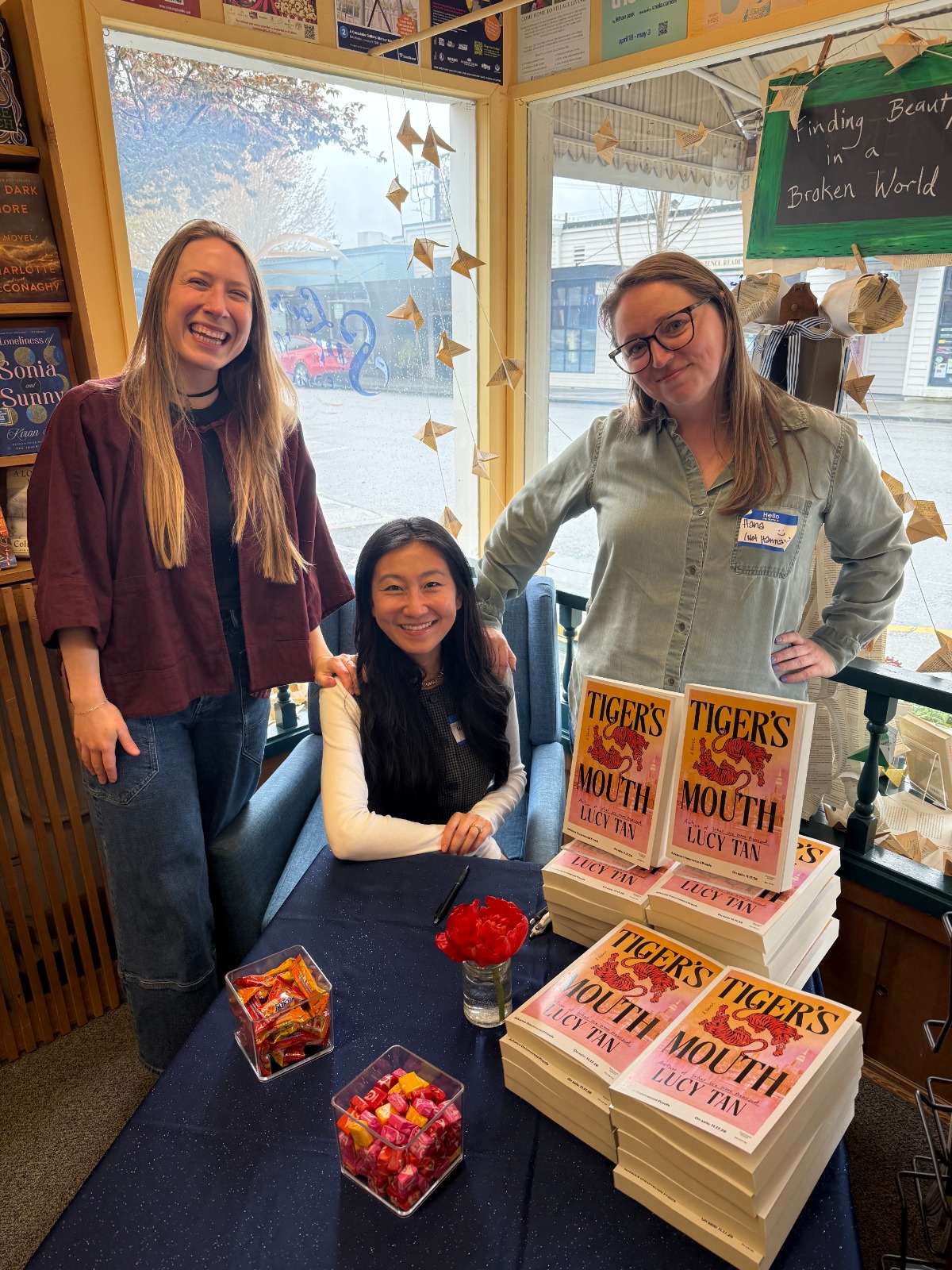
Three days ago, advanced reader copies of Tiger's Mouth were available to booksellers for the first time at the Pacific Northwest Booksellers Association spring pop-up. I got to sign at the most charming store, Edmonds Bookshop in Edmonds, WA. It's full of cozy creativity. The owner Michelle repurposed the brown packing material bookstores regularly receive by stringing it up into a gigantic paper dragon floating above the cash registers. You can see it on the fifth slide here. Below: With family from Secret Garden, who came to support.
Check out my website at lucyrtan.com
Were you forwarded this newsletter by a friend?
Sign up for yourself here!