


From Middle America to the Ends of the Universe
Happy Wednesday!
I have a news item before I get to this month's main topic.
Audiobooks Going Wide
I prefer distributing my books as widely as possible. My reason, as I've mentioned before, is that I want as many readers as possible to find and read my stories.
The unfortunate exception to that has been audiobooks. The cost to pay a producer to make an audiobook is fairly steep to pay for it in advance. So far, my audiobooks have been produced under a system where the producer gets paid 50% of the royalties— but the catch is that the audiobooks could only be distributed through Audible, Amazon, and Apple.
Fortunately, the exclusive licenses are beginning to expire, so I can now redistribute the audiobooks to listeners everywhere. So far, released for wide distribution are the three books of the Confederated Worlds series.
In a world where AI audio is easy to make, these books stand out. Not just because they're human-narrated, but because the narrator, Tim Brunson, is a retired U.S. Army colonel. How many military science fiction novels are narrated by someone with decades of active duty experience? I don't know of any but the Confederated Worlds audiobooks.
If you like military sci fi audiobooks, or have friends who do, look for the Confederated Worlds series at your favorite audiobook seller—Google Play, Kobo, Spotify, etc.— or your local library's digital content app.
Remember When SF Covers Looked Like SF Covers?
Every time I go to a bookstore, I peruse the science fiction section mainly to see what's new in cover design trends from traditional publishers. Even if their market share is slipping, they still set the standard in many aspects of the book trade.
In recent years, I've noticed that a lot of science fiction book covers don't look like the science fiction book covers I remember growing up in the '80s.
The dominant aesthetic now is big graphic elements and huge font sizes. Gone are visions of spaceships, astronauts, and alien planets. Compare and contrast classic vs. current covers for Dune, Fahrenheit 451, and 2001: A Space Odyssey and you'll see what I mean. (Full disclosure, affiliate links).
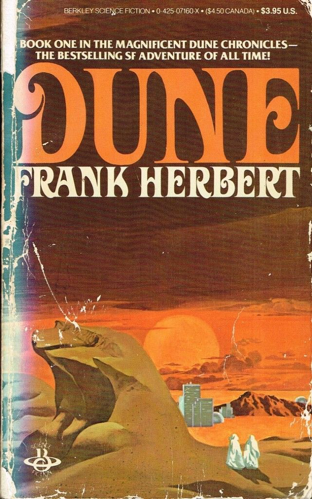
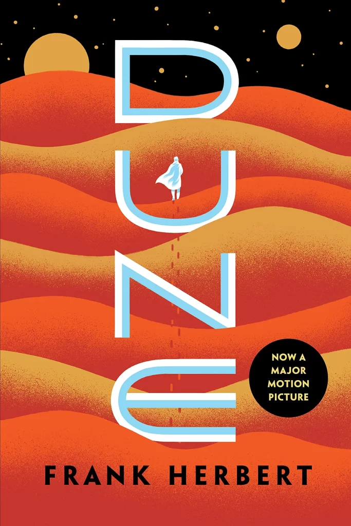
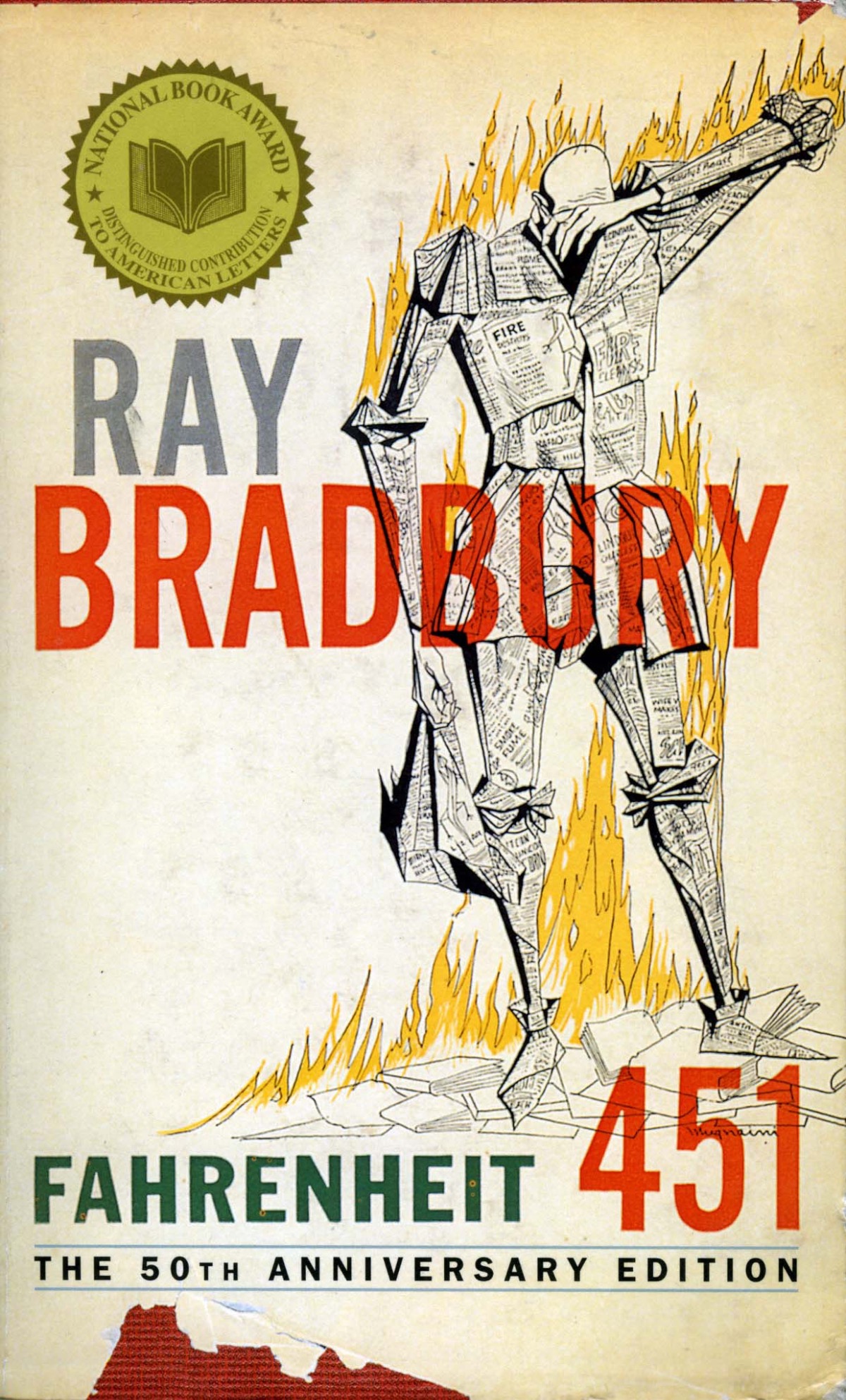

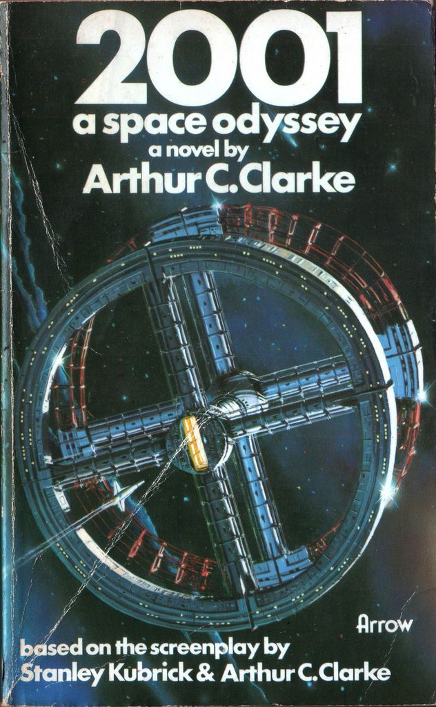
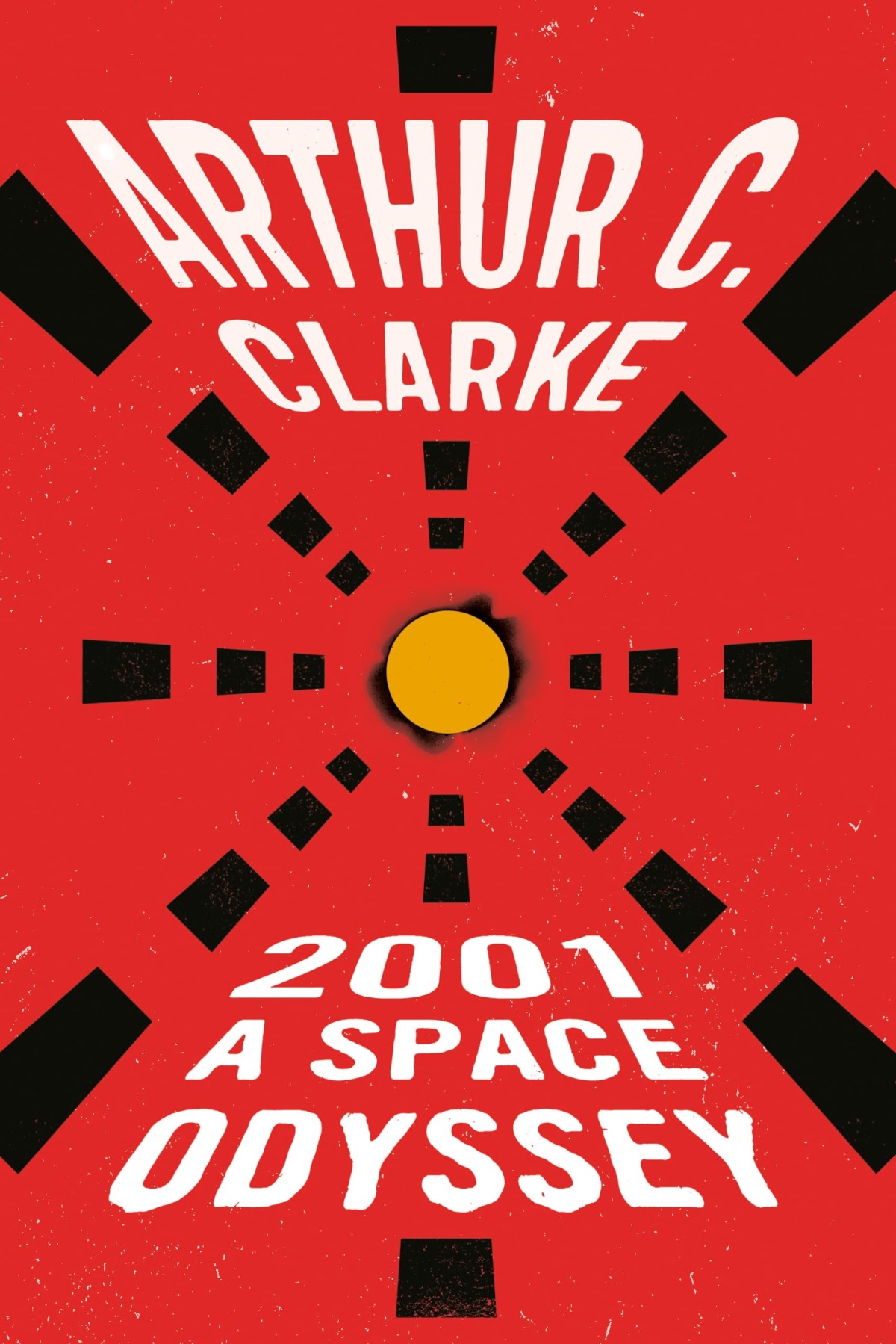
There's an exception for books adapted into movies — witness the recent Dune covers featuring Zendaya and Timothée Chalamet, styled with the fonts from Denis Villeneuve's films. That's nothing new, though; publishers have been re-covering books with movie tie-in imagery since Blade Runner renewed interest in Philip K. Dick's Do Androids Dream of Electric Sheep?
Why the style change?
Two possibilities come to mind. Both of them make traditional publishing look bad. They demolish the traditional publishing pretense of dedication to literary quality as the only driver.
The reader embarrassment factor
The hypothesis here is that people might be willing to read science fiction, but they don't want to be seen doing so in public.
Maybe. I can tell you an anecdote about Bradley Denton's niece sometime that supports this hypothesis.
However, the anecdote is almost 40 years old. And the books getting the new cover aesthetic are not obscure ones like Bradley Denton's first novel. (No offense, Bradley!). They are well-known novels with their titles at very large point sizes. Even if some readers still turn up their nose at science fiction, most of them have heard of Dune and 2001: A Space Odyssey.
Sparing readers the embarrassment of being seen with a science fiction book is not the reason.
So why has trad pub shifted to this aesthetic?
Enshittification Without (Obvious) AI
Enshittification was the 2023 word of the year, though it could easily have been word of the decade so far. I'd argue it's the word of the whole post–Cold War era.
For those unfamiliar: it's a business trying to boost profits through some combination of providing inferior goods and services, raising prices, and cutting labor costs. It's often paired with a monopolist mindset of what's the customer going to do? Switch to MySpace/Linux/DuckDuckGo/local brick & mortar/etc.?
This book cover style is a clear case of cutting labor costs. Real science fiction book covers back in the day were commissioned from artists you might have heard of—Boris Vallejo, Frank Frazetta, Michael Whelan—at a cost of thousands of dollars each. That's thousands of dollars of expense that a giant corporation would be glad to cut. Might a lower quality cover hurt sales? Maybe. That's next quarter's problem.
The obvious alternative to a $5,000 professional cover is a $100-a-month enterprise subscription to Ideogram or some other AI art generator. But trad pub has cut itself off from that avenue. It has denounced AI so heavily— multiple writers losing six-figure and even multi-seven-figure book deals over the mere perception that they might have used AI in their writing— that even a giant, otherwise-happy-to-be-hypocritical corporation is wary of spending its social capital papering over the hypocrisy. Plus, about all trad publishers have left is positioning themselves as curators of books by human creators, as opposed to indie books that are supposedly all AI slop.
But if you can't use AI, and you don't want to spend five grand for a real cover artist, what do you do? You spend a few hundred bucks on a graphic designer to generate these things instead. You end up with, say, desert-themed sand colors, sand-dune-shaped vector graphics, and big chunky text for Dune. Rectangles reminiscent of the pod bay doors or Bowman's entry into the Jupiter monolith in the film version of 2001. A clip art book of matches for Fahrenheit 451.
Or, if one were even more cynical, trad pub might be spending $100 per month on an Ideogram subscription and hoping there are no tells that they're using AI-generated vector graphics.
Agree? Disagree? Have a different take? Reply to this email. I would enjoy hearing the opinion of science fiction readers like you.
Till next time,
Happy Reading!
Raymund
0 comments