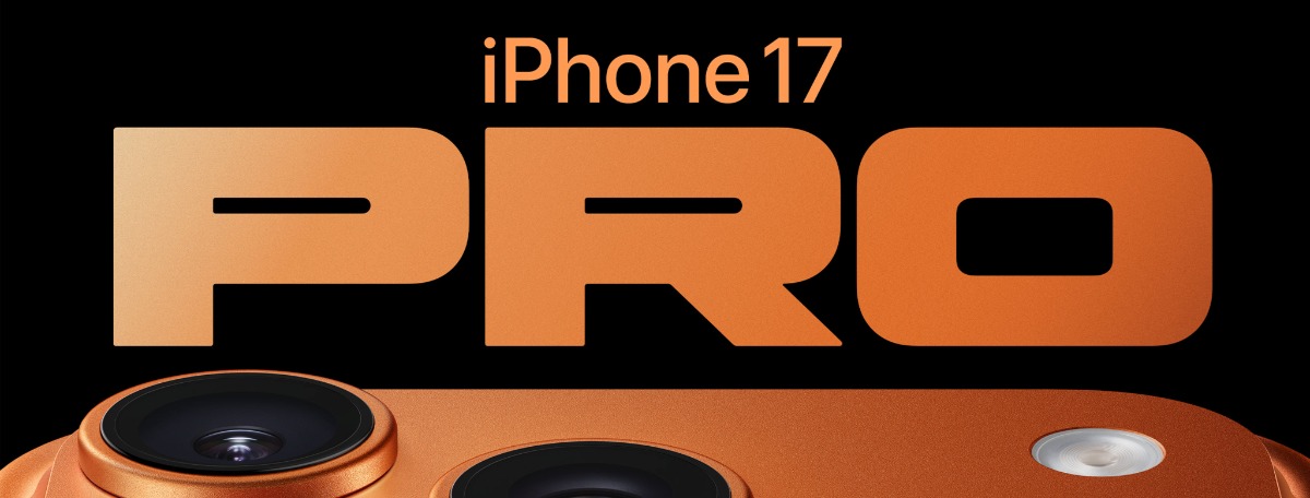
Apple’s new iPhone 17 Pro typography has broken with decades of restraint. The once-silent brand now shouts in bold, extended letters, a move that reveals as much about design’s future as it does about Apple’s loss of typographic grace. 👉 Read my full critique: When Apple Forgot How to Whisper, a deep dive into the end of visual restraint and the rise of typographic vanity.
The new iPhone 17 Pro wordmark isn’t progress, it’s noise.
Apple traded proportion for power, clarity for spectacle. Tschichold would have winced.

Get the next issue in your inbox
Free, and you can unsubscribe any time.
0 comments