
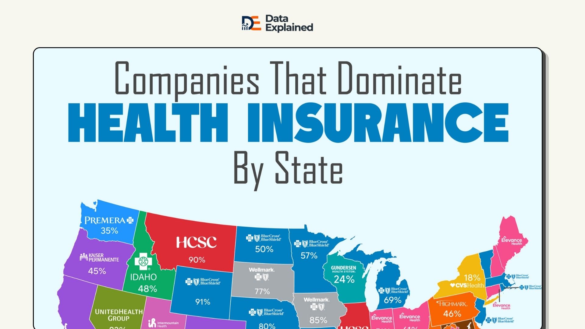
What Companies Are Winning Health Insurance In America?
In the visualization above, 13 U.S. states have a single health insurer controlling more than 80% of the large-group…
Read article →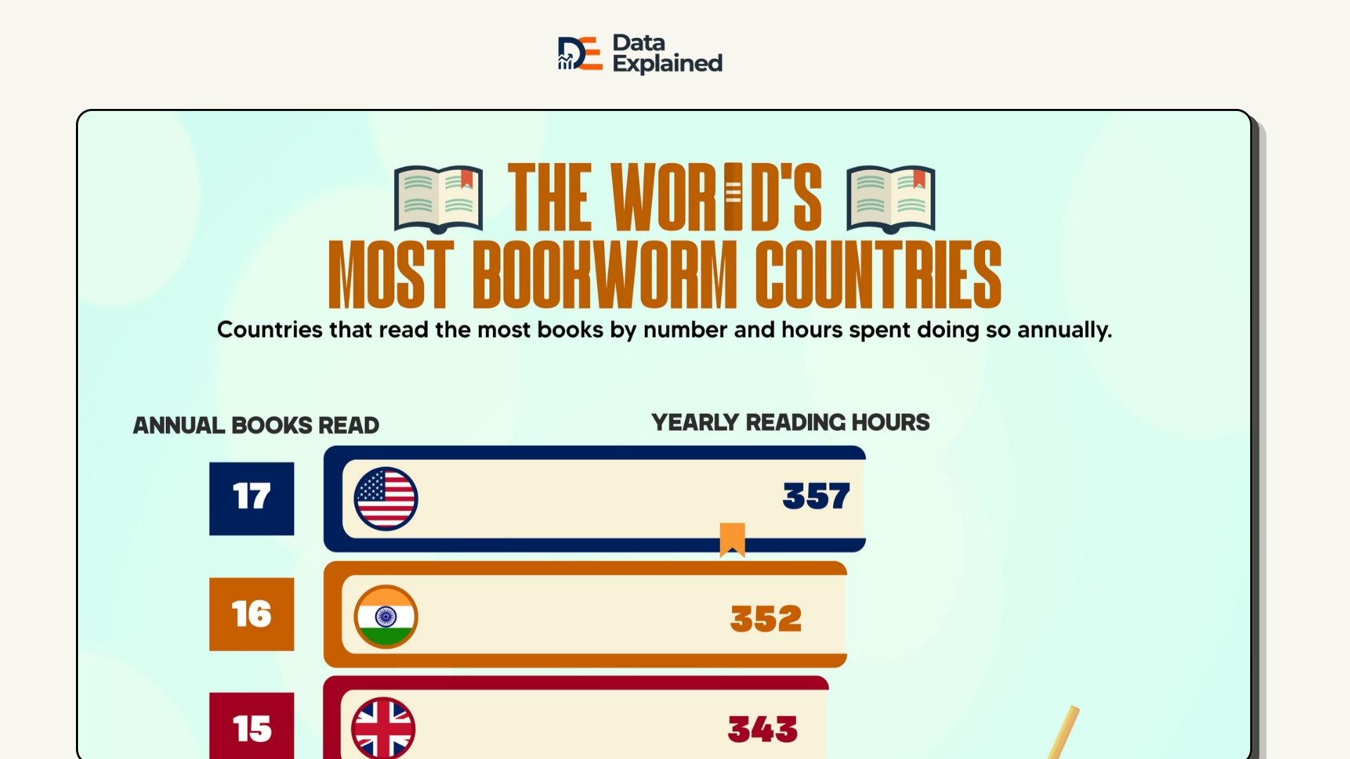
Where Do People Read The Most Books Annually?
You’re looking at, above, a chart showing which country read the most books by book count and hours spent doing so in…
Read article →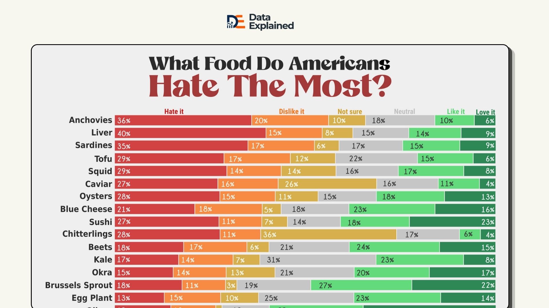
Data Shows America’s Most Hated Foods Are Mostly Seafood
Many Americans have strong opinions about food (especially what not to put on their plates). Anchovies rank as the…
Read article →
Iran Has More Submarines Than the UK and France Combined
Iran operates 25 submarines, more than the United Kingdom and France combined (10 and 9, respectively), for a total of…
Read article →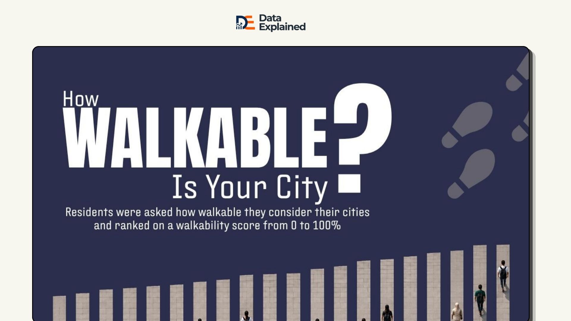
Survey Reveals What Cities Are Most Walkable In 2026
The visualization above shows Seoul and Edinburgh as the most walkable cities, both scoring 93% when residents were…
Read article →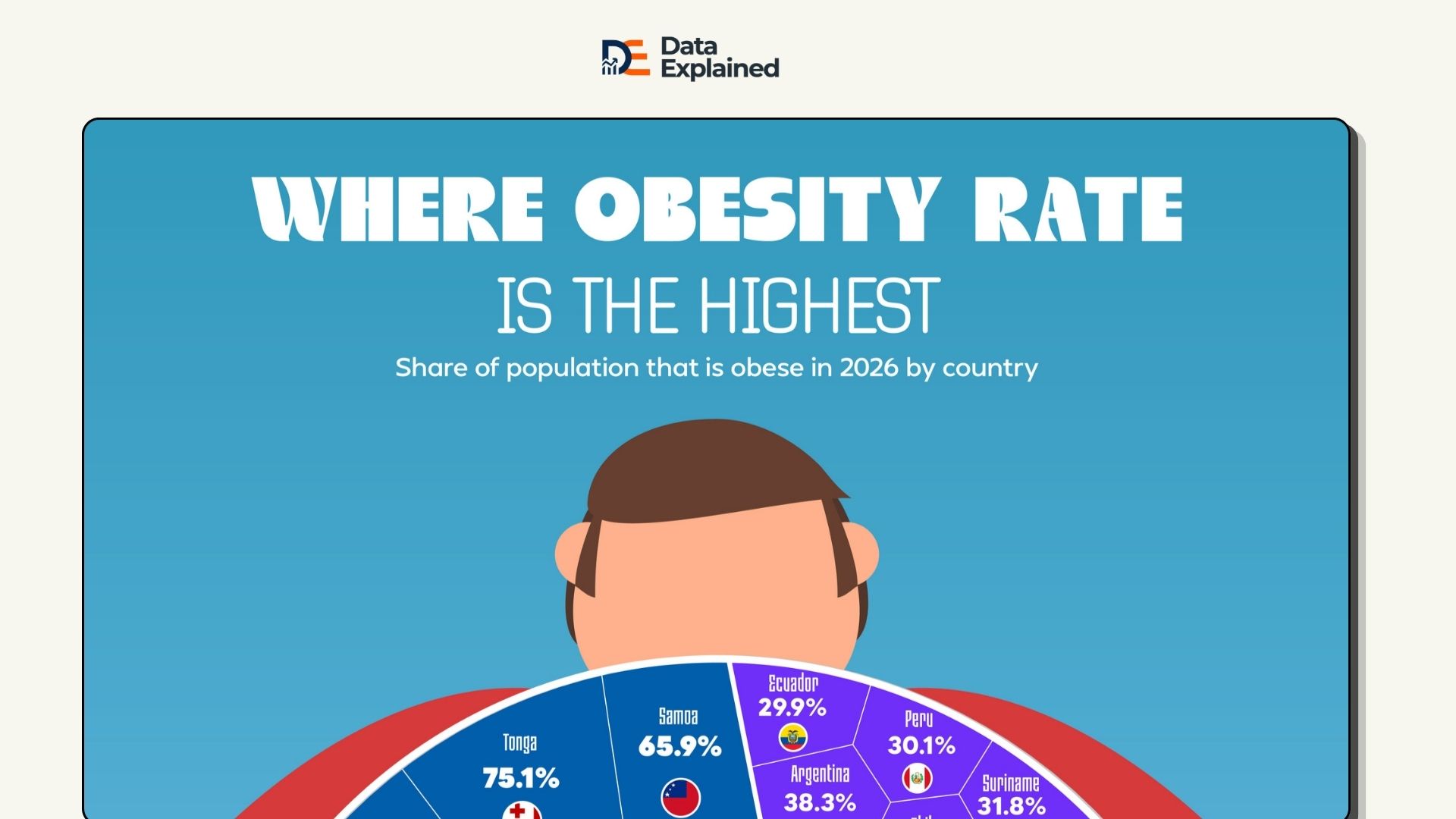
The World’s Most Obese Countries Are From Oceania
Oceania dominates the top of the obesity rankings, holding all 10 of the highest positions in this visualization. The…
Read article →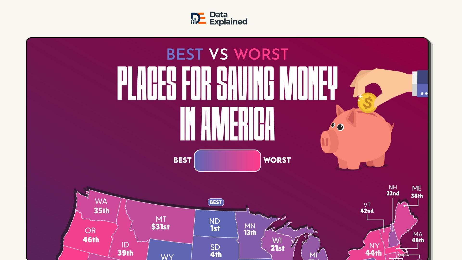
Hawaii Ranks as Worst State For Saving Money
When it comes to the best places for saving money in America, Hawaii has been found to be at the bottom. Financial…
Read article →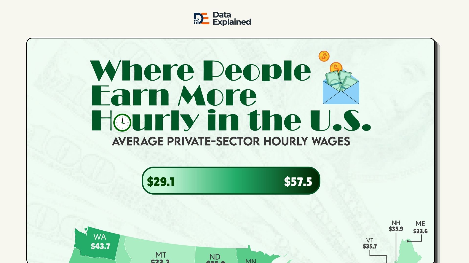
Mapped: Where People Earn More Hourly in the U.S.
The visualization above shows us how much regular workers at private companies make per hour in each part of the…
Read article →